Cohort Analysis Fundamentals: Reading a Cohort Grid Correctly

I’ve seen cohort grids used to justify bad investment decisions at least three times. Each time, the problem wasn’t the data — the grid was correct. The problem was misreading it: comparing incomplete cohorts, averaging paid and free users into one curve, or celebrating a single good cohort before trend data existed. Cohort analysis is not complicated, but the failure modes are specific and consistent.
This post is a fundamentals guide: what a cohort grid shows, how to read rows and columns correctly, what retention curve shapes mean, and five misreadings that have cost teams real money. No tool-specific instructions — the principles apply to GA4, Mixpanel, PostHog, Amplitude, or SQL in your warehouse.
What a Cohort Is
A cohort is a group of users who did the same thing in the same time window. The most common definition is “users who signed up in a given month.” But cohorts can be defined on any event:
- Acquisition cohort — users who signed up in week W
- Feature adoption cohort — users who first used feature F in week W
- Plan cohort — users who started plan P in month M
- Campaign cohort — users acquired through campaign C
The cohort’s defining action is the anchor. Everything else is measured relative to that anchor.
What a Cohort Grid Shows
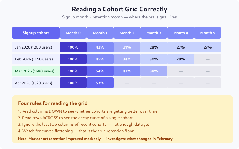
Each row is one cohort — the users who signed up in that month. Each column is time elapsed since that cohort signed up: month 0 is always 100%, month 1 is the percentage still active a month later, and so on.
The diagonal edge on the right side is not missing data — it’s the future. The Apr 2026 cohort only has month 0 and month 1 because there hasn’t been a month 2 yet. Reading those empty cells as zero is the most common first mistake.
The Four Rules for Reading the Grid
Read columns down
Columns show whether newer cohorts are retaining better or worse than older ones. In the example grid, month 1 retention goes 42% → 45% → 54% → 53% from January to April. That’s a real trend: something changed in February or March that materially improved first-month retention. This is the most actionable read.
Read rows across
Rows show a single cohort’s decay curve. A healthy cohort starts at 100% and settles at a floor. An unhealthy cohort keeps decaying indefinitely. The difference is visible in the third or fourth column.
Ignore the last two columns of recent cohorts
If you’re reading the grid on April 15 and your most recent cohort signed up in April, its month 0 is incomplete — some users haven’t had time to come back yet. Mask the last two columns on the right, always, or grey them out. Treating them as real numbers has ended more than one weekly metrics review in confusion.
Watch for the floor
The “retention floor” is the percentage that never churns — your true core users. A cohort whose curve flattens at 27% means 27% of those users are staying indefinitely. A curve that never flattens means you have no stable base, and every month is a new acquisition problem.
Three Shapes of Retention Curves
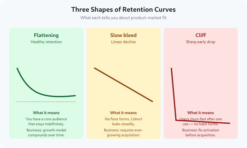
The flattening curve (smiling or settling)
Retention drops fast in the first period or two, then flattens. This is what product-market fit looks like. A specific slice of users finds the product essential, and they stay. The flatter and higher the floor, the better.
Typical floors by vertical: 25-35% for consumer apps, 40-60% for B2B SaaS, 60-80% for enterprise software.
The slow bleed (linear decay)
Retention drops at a roughly constant rate with no floor. This is the most common shape for products without strong habit loops — content sites without subscriptions, tools people use once or twice, social apps without a community.
Business implication: you need ever-growing acquisition to stay flat. LTV is bounded and usually low.
The cliff
A sharp drop in the first period followed by near-flatness at a low level. Users try the product once, don’t come back, and only a tiny residual keeps using it. This is a broken activation problem — users don’t hit the aha moment in their first session.
Fixing activation always beats fixing retention when you have a cliff. See Activation Metrics for how to measure the aha moment.
Defining “Retained” — The Choice That Decides Everything
“Retained” is not self-evident. You must choose what counts, and your choice determines what the grid says. Options, in order of strictness:
- Any session — user opened the app at least once. Easiest to hit, least meaningful.
- Active session — user performed at least one intentional action (click, scroll with dwell time, API call from logged-in context).
- Core action — user performed the action the product exists for: wrote a message, listened to a song, completed a task. This is the right choice for most products.
- Monetized action — user made a purchase, renewed a subscription, or triggered a billable event.
Be explicit. “Monthly active users” means nothing without the definition of “active.” I once audited a product that counted push notification opens as “active” — their retention looked brilliant until we switched to core-action definition and discovered 40% of “retained” users never opened the app.
Five Common Misreadings
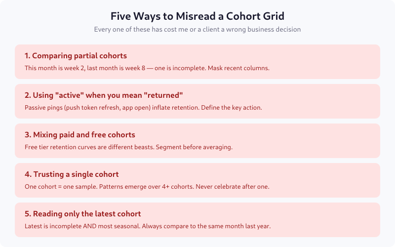
1. Comparing partial cohorts
If cohort M is on month 2 and cohort M-2 is on month 4, they’re at different maturity. Declaring one “better” is meaningless. Always compare cohorts at the same lifecycle age.
2. Using “active” when you mean “returned”
Ping events, background refreshes, and authentication token renewals can register as “activity” without a real user interaction. Retention on those looks great and means nothing.
3. Mixing paid and free cohorts
Free users churn fundamentally differently than paid ones. Averaging them produces a blended curve that describes no actual user group. Segment first, then compare.
4. Trusting a single cohort
One good cohort is noise. Four good cohorts in a row is a trend. Declare victory only after the pattern repeats. I’ve seen teams ship launch celebrations after a single month’s cohort outperformed — and watched the same cohort collapse in month 3 when the curve resumed normal shape.
5. Reading only the latest cohort
Recent cohorts are both incomplete and most subject to seasonality. Comparing April 2026 to March 2026 without comparing to April 2025 conflates trend with season. For seasonal products (ecommerce, travel, fintech), year-over-year is the only valid comparison.
What Cohort Grids Hide
The grid averages all users in a cohort. It hides:
- Segment differences. Pro users may retain at 70% while free users retain at 15% — the blend (maybe 25%) describes nobody.
- Revenue concentration. 5% of users may drive 80% of revenue. If those 5% churn, a retention curve that looks healthy can mask catastrophe.
- Frequency. A user who came back once and a user who came back 30 times both count as “retained” in month 1.
For depth, complement the grid with frequency distribution charts and per-segment curves. The grid is the first view, not the whole view.
Building Your First Grid
If you’re starting from zero, pick three things:
- The cohort anchor — signup week or month, most likely
- The retention event — the single core action your product exists for
- The time granularity — weekly for consumer, monthly for SaaS, daily for transactional apps
Compute retention as: users in cohort who performed the retention event in period N divided by total users in cohort. That’s it. Tool-specific queries look different; the math is identical.
FAQ
Which is better: weekly or monthly cohorts?
Depends on user frequency. Products users visit daily or weekly (social, messaging, fitness) should use weekly cohorts. Products with monthly or quarterly cadence (enterprise SaaS, long-cycle purchases) use monthly. Too-fine granularity creates noise; too-coarse hides activation issues. Match the cohort period to the natural use cadence.
What retention rate is good for my industry?
At month 6, typical benchmarks are: 25-35% for consumer mobile apps, 40-55% for freemium SaaS, 70-85% for paid B2B SaaS, 85-95% for enterprise contracts. These are rough — a new product category or a specific vertical can sit well outside the range. Compare yourself to yourself (last quarter vs this quarter) more than to public benchmarks.
How many cohorts do I need before I can trust the pattern?
Four at minimum. Three is a coincidence; four shows up as a trend in the grid. For quarterly business decisions, ideally six cohorts so seasonality starts to become visible. Single-cohort conclusions are almost always wrong in hindsight.
Can I use cohort analysis for A/B test results?
Yes, and you should. Cohort users by test variant assignment, then compare retention curves. This catches the common case where variant A lifts week-1 conversion but tanks week-8 retention. Short-term A/B metrics lie constantly; cohort curves don’t.
What’s the difference between retention and churn?
Two views of the same data. Retention is the percentage still active at time N; churn is the percentage who left between time N-1 and N. Retention is more useful for trend spotting across cohorts; churn is more useful for revenue forecasting. Both come from the same grid.
Where to Go Next
Build the grid for your core retention event. Look at the last six months. If the curves are flattening, you have product-market fit somewhere — the next question is which segment. If they’re still bleeding after month 6, activation is likely your bottleneck, not retention. The grid tells you where to look; segmenting and cohort-level deep dives tell you what to fix.
Lukas Meier
Product Analytics Specialist with 10 years of experience configuring tracking for e-commerce and SaaS products across Europe. Creator of EU-Medin.
more →